Resource guide
What Photos Should You Put on a Model Comp Card?
How to choose headshots, full-length images and supporting shots before you build your card.
Your comp card or composite card (or zed card) is only as strong as the photos you choose. This guide explains which images usually work best on the card layout, how to show range without confusing the design, and common mistakes to avoid. If you are shooting agency digitals first, those are meant to show what you look like plainly; your comp card can then highlight your stronger angles and presence, see our at-home photoshoot setup guide for the full digitals shot list.
Start with your strongest headshot
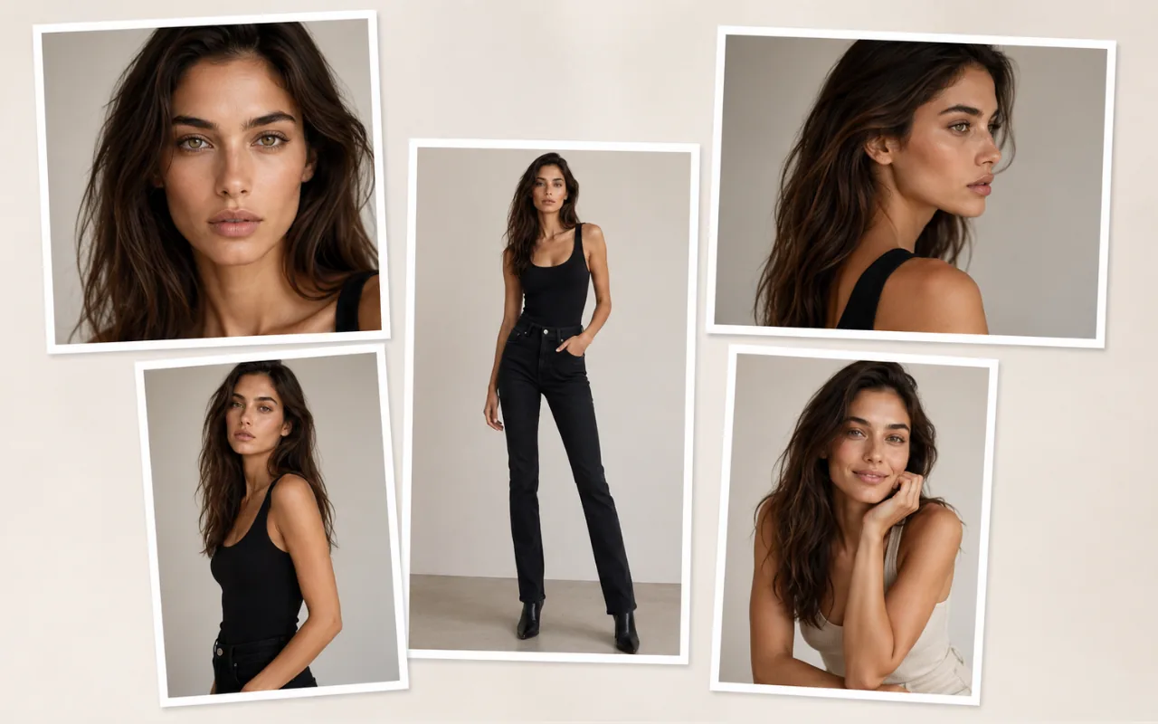
The front or main image on a comp card is usually your clearest, strongest representation of how you look today. Casting teams often see this image first, so it should communicate your face, expression and overall presence quickly.
A useful main headshot usually has:
- a clear, unobstructed face
- good, even light
- minimal or no heavy editing
- eyes visible and in focus
- a simple, natural expression, comp cards can show a bit more personality than plain digitals
- enough space around the face, not cropped too tightly
You do not need a dramatic pose for this image. Clarity and consistency often matter more than styling.
Include a full-length image
At least one full-length photo helps casting teams understand proportions, height impression and overall body shape. This is especially important when agencies or clients are reviewing cards quickly and may not meet you in person first.
Stand naturally, keep your whole body in frame from head to toe, and leave a little space around the edges so the image can sit cleanly inside a card layout. If you are building a digitals set for agencies, plan for full-length views from the front, both sides, and the back, plus a side profile where you are not looking at the camera, your comp card will usually use one strong full-length from that set. Simple fitted clothing usually works better than oversized layers that hide your shape.
Add variety without confusing the card
Supporting images should show range, but still feel like the same person. If every photo has a different filter, background or styling, the card can look less cohesive.
A balanced starter set often includes some combination of:
- one clean portrait
- one full-length image
- one three-quarter body shot
- one profile or angled shot
- one image with a slightly different commercial or editorial expression
You do not need every type on day one. Choose images that complement each other and reflect the kind of work you are aiming for.
What to put on the front vs the back
Layouts vary by template and market, but many model composite cards follow a similar structure:
Front
- your strongest main image
- name
- agency or basic contact details
Back
- supporting portfolio images
- measurements and key stats
- additional contact or agency information
When you build your card in The Looksheet, you can preview how your front and back images and details sit together before you export.
Commercial vs fashion model photo choices
There is no single correct look for every model, but the type of work you want can guide your photo choices.
Commercial models
Commercial casting often favours warmth, approachability and a natural lifestyle feel. Useful qualities in photos can include:
- a friendly or approachable expression
- a natural smile where appropriate
- relatable, clean styling
- images that feel accessible rather than overly dramatic
Fashion / editorial models
Fashion and editorial work may lean toward stronger structure, posture and line. Supporting images might emphasise:
- a strong face and bone structure
- confident posture
- clean body lines
- more minimal styling
- slightly more dramatic or editorial expressions
If you are unsure which direction fits you, look at the agencies or markets you are targeting and notice what their models' cards tend to show.
Photos to avoid
These are common reasons otherwise good models weaken their comp cards:
- mirror selfies
- heavy filters, skin-smoothing apps or obvious retouching
- tilted camera angles that distort height or proportions
- over-posed or overly styled shots that hide your natural shape
- hands in pockets, on hips, or held up, fine for some portfolio shots, not for basic digitals
- sunglasses hiding the eyes
- group photos where you are not clearly the focus
- low-resolution screenshots
- blurry or out-of-focus images
- busy or cluttered backgrounds
- old photos that no longer reflect your current look
- images where your face is hidden by hair, hats or shadows
- overly sexualised or overly styled photos that do not match the brief
- visible brand logos, unless intentional and appropriate for the work
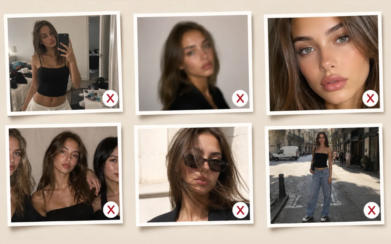
When in doubt, choose the image that shows you most clearly and honestly.
What if you only have phone photos?
Many aspiring models start with phone images, and that can be enough for a first digital comp card if the photos are well lit, recent, sharp and simple. Professional shoots can come later as your portfolio develops.
If you need help capturing cleaner starter images, see our at-home photoshoot setup guide.
Final photo checklist
Before you build your card, ask:
- Is your face clear in the main image?
- Is your full body visible in at least one photo?
- If submitting digitals to an agency, do you have the angles they ask for (not just one selfie)?
- Are the photos recent?
- Do they look like the same person?
- Is the background clean?
- Are they free from heavy editing?
- Do they fit the type of work you want?
- Are your measurements and contact details current?
What Does a Professional Model Comp Card Look Like?
A finished professional model comp card usually has a clean, uncluttered layout. Your strongest headshot or main image sits on the front with your name and agency details; the back holds supporting model comp card photos and your measurements in a format agents can scan in seconds. Everything above on what to put on a comp card feeds into that structure: even lighting, consistent styling, and images that read clearly at print size.
The Looksheet templates are based on agency-standard composite card examples from UK, US and European markets. To see sample model comp cards with that layout already built in, view comp card templates and choose one that fits the kind of work you are aiming for.
Create your comp card
Once you have selected your best headshot, full-length image and supporting photos, upload them to The Looksheet and create a clean comp card in seconds, free, with no signup required.
Create your comp card free